Feature
Responsive testing across phone, tablet, and desktop
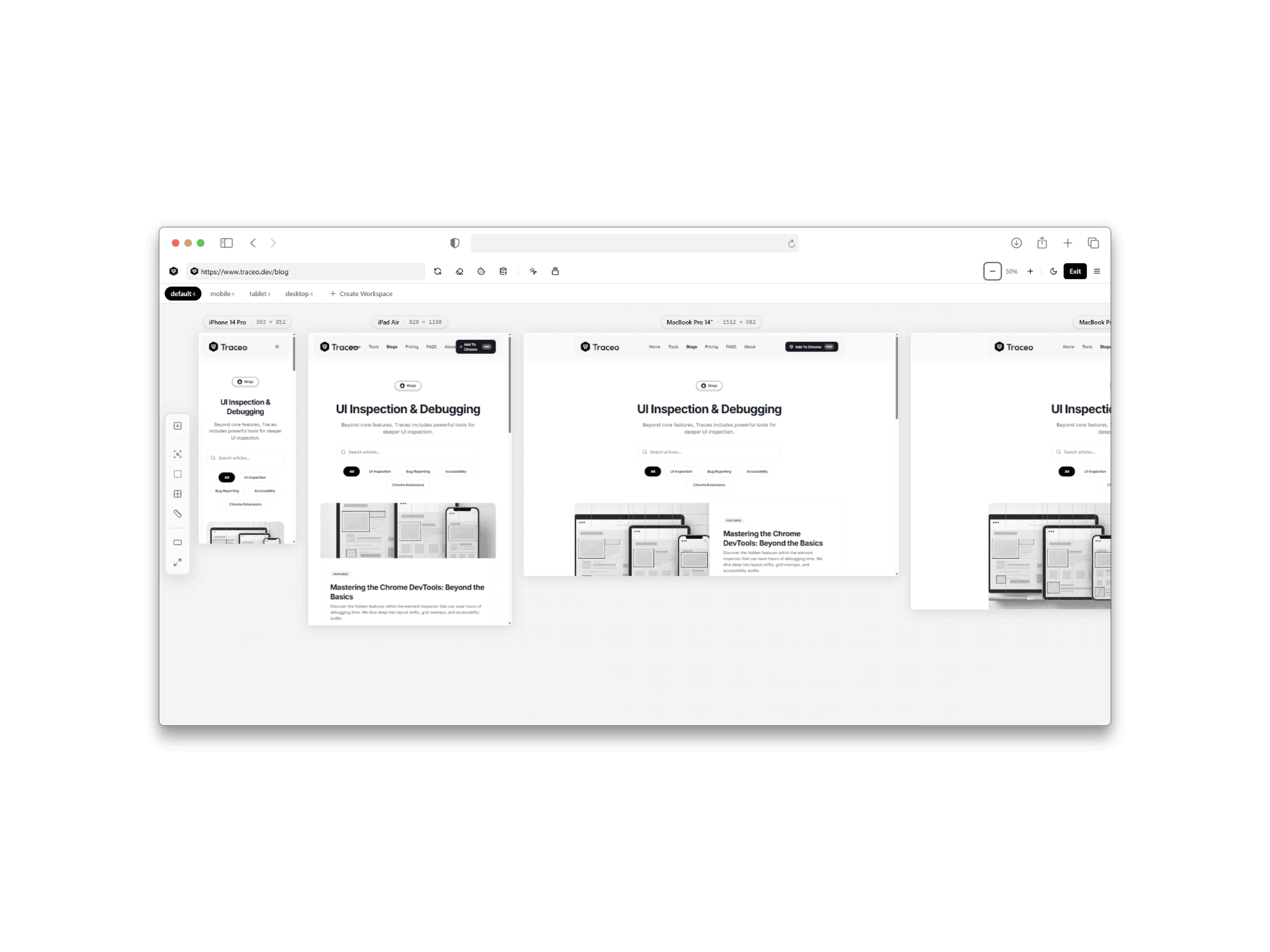
Layout bugs often appear only at specific breakpoints. Traceo’s responsive testing workflow lets you preview phone, tablet, and desktop sizes, inspect layout behavior, and capture issues in context.
Benefits
- Switch between mobile, tablet, and desktop previews in one click.
- Inspect layout shifts and spacing at each breakpoint on the live page.
- Capture responsive issues as screenshots or recordings for clearer handoff.
Who it is for
- Frontend developers validating breakpoints before release.
- Designers checking fidelity of responsive comps on real pages.
- QA documenting viewport-specific visual bugs.
FAQ
- What devices can I preview?
- Switch between common phone, tablet, and desktop breakpoints to validate layout without resizing the browser manually each time.
- Can I inspect CSS while in responsive mode?
- Yes. Responsive testing pairs with Traceo’s inspection tools so you can check styles and spacing at each size.
- How do I share a responsive bug?
- Capture a screenshot or screen recording at the failing breakpoint so engineers see the exact viewport and UI state.
Related capabilities
Use Traceo in Chrome
Install from the Chrome Web Store or join via early access.