Design QA
The Hidden Cost of Screenshot-Only UI Handoffs
A designer says the spacing should be 16px. A developer sees 14px in production. QA opens a bug.
And suddenly nobody agrees on what "correct" actually means.
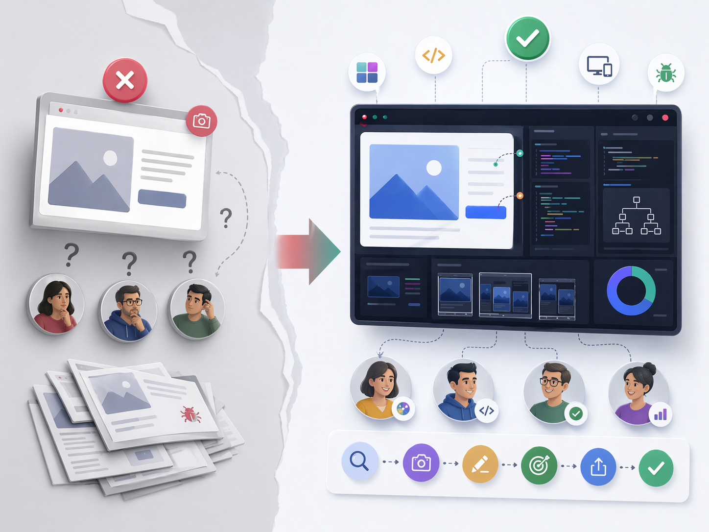
That is the hidden cost of screenshot-only handoffs. They look simple, but they often create delays, confusion, and long comment threads that slow down shipping.
Why screenshots alone fail
Screenshots are useful, but they are incomplete.
They hide responsive breakpoints, computed CSS values, interaction states like hover or focus, browser and device differences, and clues from the console or network. A screenshot is evidence of appearance, not evidence of implementation.
If the report does not include the right context, each person on the team may interpret the issue differently. The result is often ping-pong comments, delayed releases, and bugs that come back after a quick fix. That is why many teams move from static captures to UI inspection and CSS inspection on the live page when precision matters.
What a good handoff includes
A good UI handoff is more than a file transfer. It is a shared definition of what "correct" means.
It should include:
- Visual intent: spacing, typography, color, hierarchy.
- Functional behavior: interactions, transitions, edge states.
- Technical truth: computed styles, DOM structure, breakpoints.
- Acceptance criteria: measurable rules that define when the work is done.
A workflow that actually ships
- Inspect the live UI:Check spacing, font sizes, line height, colors, and component states directly in the browser,Traceo's UI and CSS inspection workflows are built for that step.
- Capture the context: Include viewport size, browser, device, and environment details with your screenshot or a recording-first capture when interactions matter.
- Annotate clearly: Mark expected vs actual behavior, affected component, severity, and reproduction steps.
- Define acceptance criteria: Use measurable checks instead of vague statements.
- Share in one package: Send the full handoff with all artifacts attached.
- Verify after the fix: Compare before and after in the same viewport and state.
Examples teams run into
- A card layout breaks at 1024px only.
- A design token says one spacing value, but implementation uses a hardcoded pixel value.
- A dropdown looks correct in idle state but shifts after typing in search.
- Contrast passes in light mode but fails in dark mode.
- A fix on one page breaks a shared component somewhere else.
These are the kinds of issues that screenshots alone rarely explain well.
How teams can measure improvement
If you want a handoff process to feel more reliable, track a few simple metrics:
- Time to first reproducible bug report.
- Number of clarification comments per issue.
- Reopen rate of fixed UI bugs.
- Average QA verification time.
- Handoff-to-merge cycle time.
Common mistakes to avoid
Many teams lose time because they rely on vague handoffs.
Common mistakes:
- saying "looks off" without numeric details
- leaving out viewport or browser information
- not including expected versus actual behavior
- skipping edge-state testing
- writing acceptance criteria after development has already started
Role-specific habits that help
- Designers should attach token references and a state coverage checklist.
- Developers should validate computed styles before marking work done.
- QA should test acceptance criteria exactly, not from memory.
- PMs should require a structured bug template before prioritizing.
When each role adds the right detail, the handoff becomes much stronger.
Final thought
A screenshot is not a handoff by itself. It is one part of a larger process that defines what the UI should do, how it should look, and how the team knows when it is truly done.