
Colors, type and contrast
Get started
Getting startedCapture
Screenshots and recordingsInspect
Colors, type and contrast
Check a whole page against your design system: every color in use, the type scale, and text that fails contrast.
Color usage
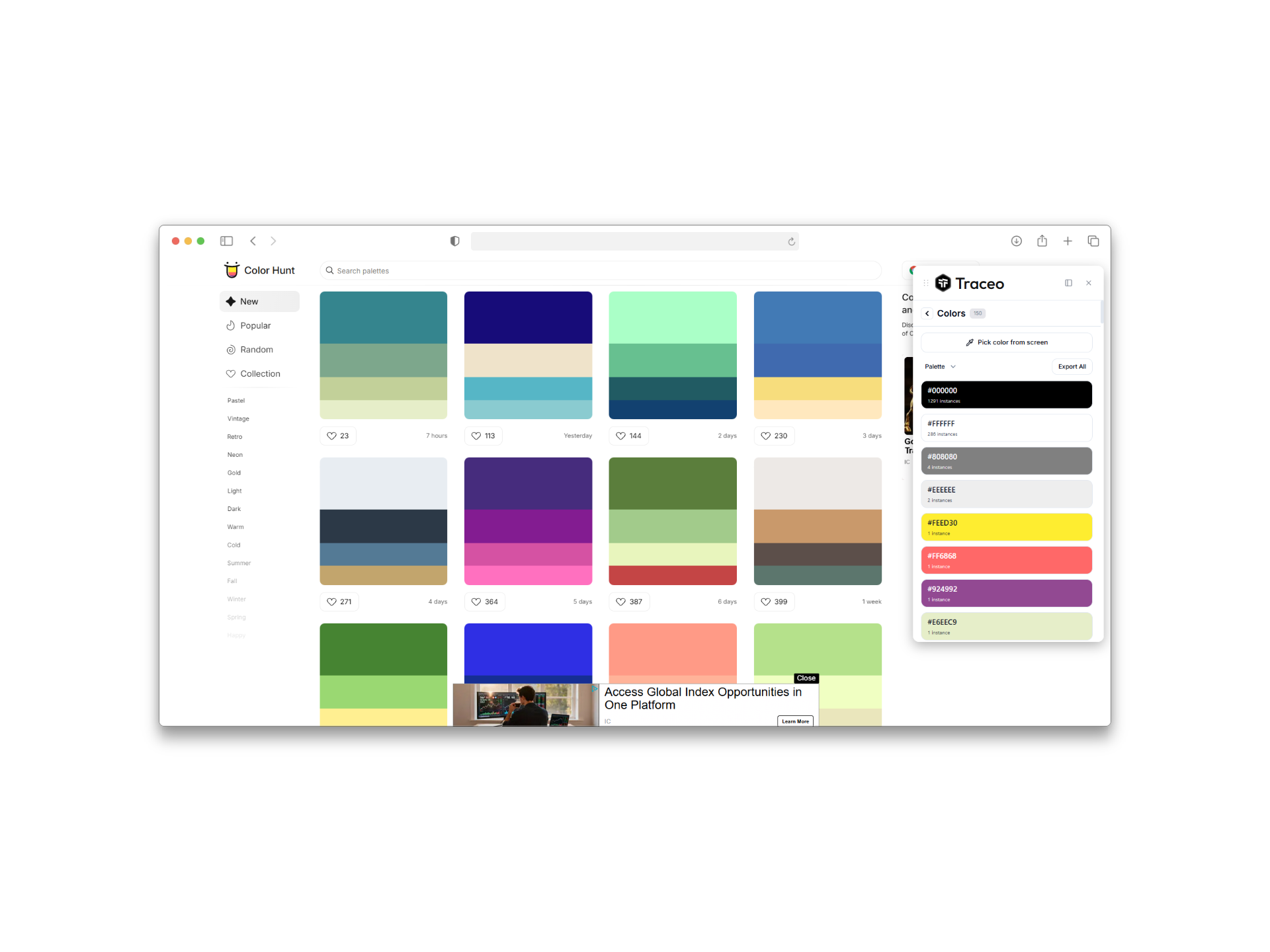
Traceo collects every text, background and border color on the page and groups them, so near-duplicates and off-palette colors are easy to spot. Click a swatch to copy it, or export the palette as swatches for Figma, Sketch or Adobe tools.
Typography
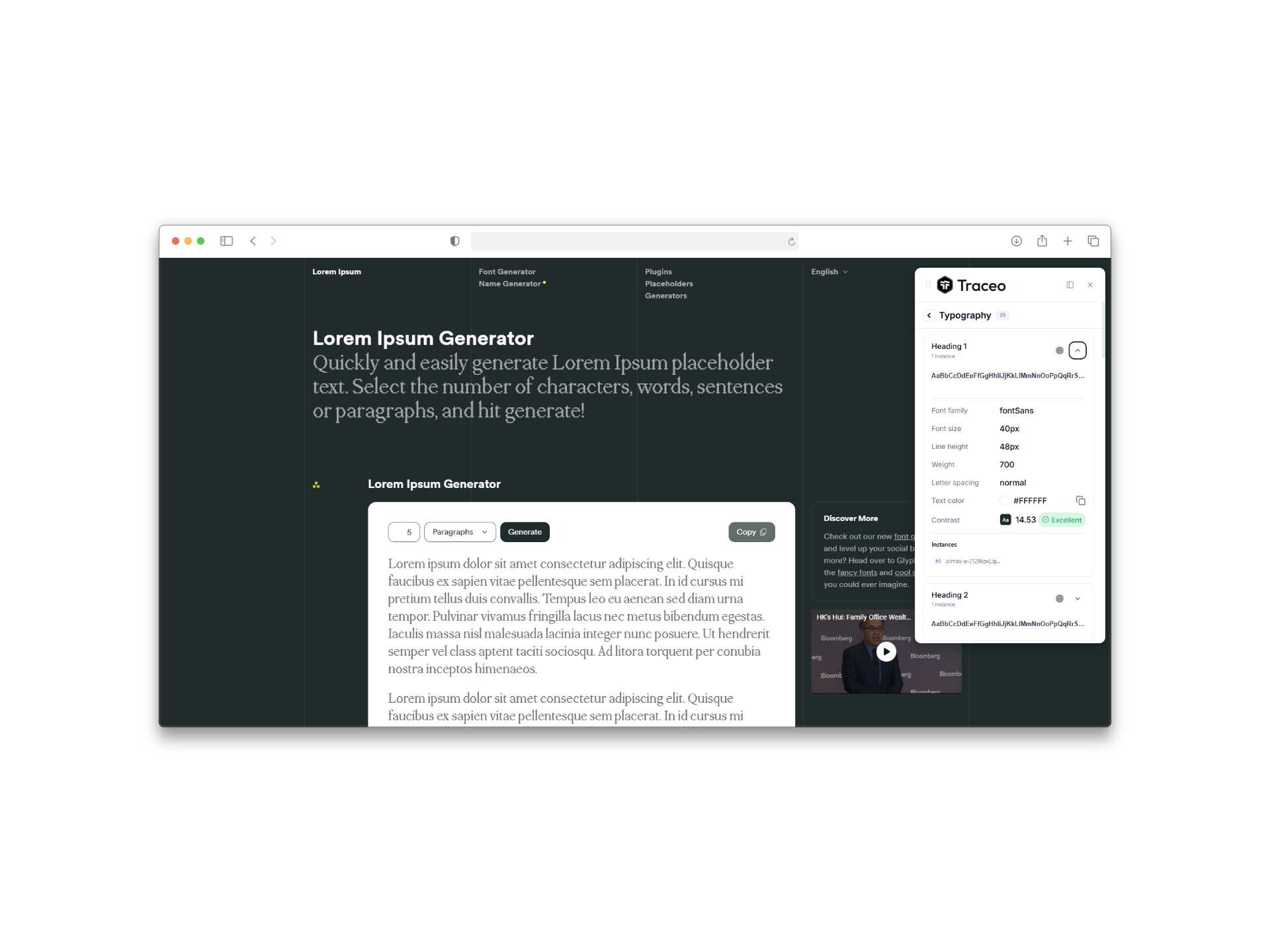
See the heading and body styles the page really uses: family, size, weight, line height and letter spacing, in hierarchy order. It is the quickest way to find the one heading that drifted from the scale.
Contrast scanner
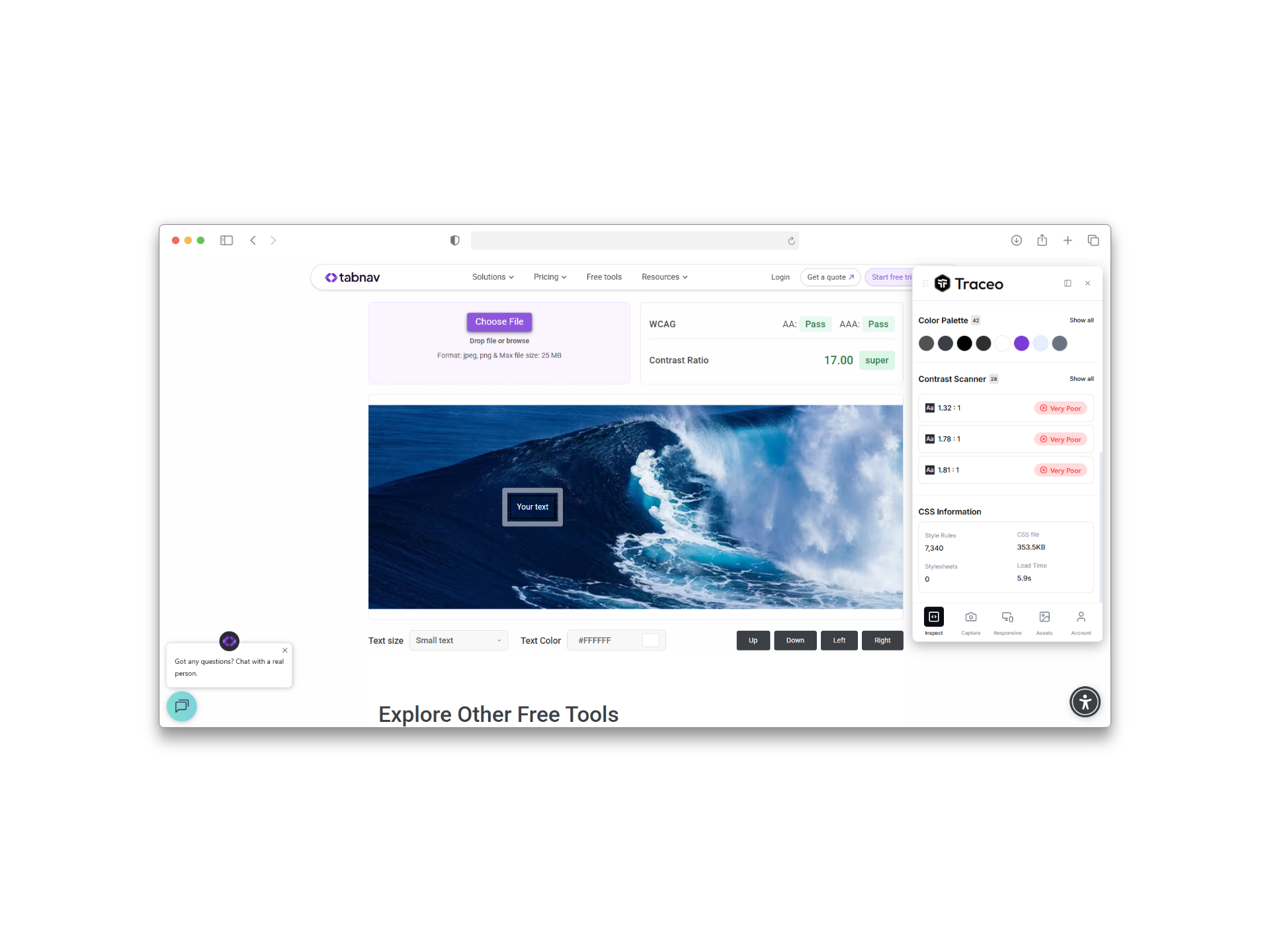
The scanner checks each piece of text against its background and reports the ratio and result:
| Result | Meaning |
|---|---|
| AA | At least 4.5:1 for normal text, or 3:1 for large text. The usual target. |
| AAA | At least 7:1 for normal text, or 4.5:1 for large text. |
| Fail | Below AA. Pick a darker text color or a lighter background. |
Check text that sits on images or gradients by eye as well: the background there changes from pixel to pixel.
Free and Pro
- The detailed typography view and the advanced contrast views are part of Pro.
- See Pricing for what each plan includes.