Accessibility
Why Your Contrast Ratio Matters More Than Ever
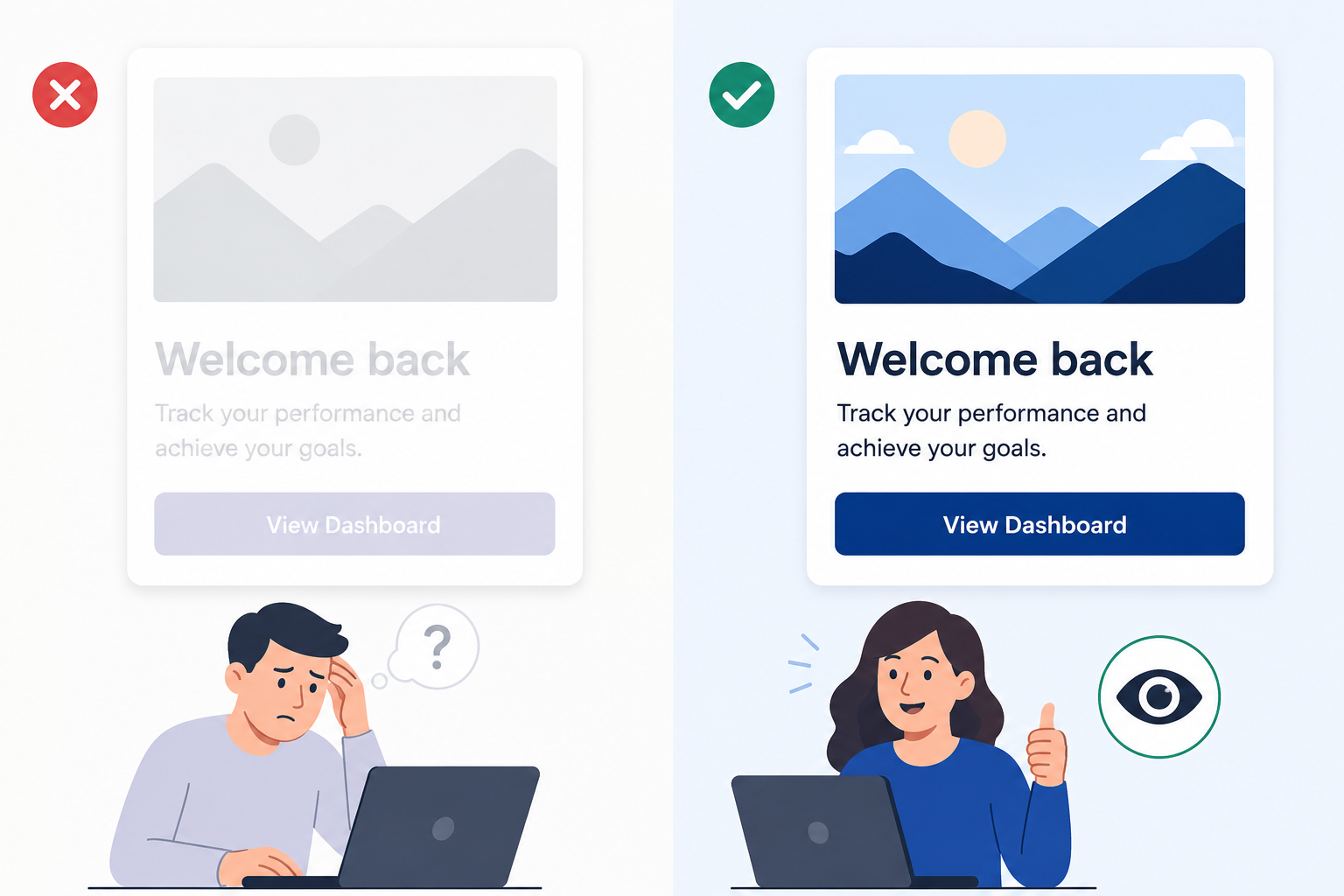
People do not stay on screens they cannot read. When text is hard to scan, users slow down, hesitate, and often abandon the flow altogether. Poor contrast is not just a design issue. It affects accessibility, usability, and conversion at the same time.
Readable interfaces matter even more in real-world conditions. Bright light, low-quality screens, fatigue, aging vision, and temporary impairments can all make weak contrast a real barrier. In that sense, accessibility and UX are not separate conversations. They are the same conversation.
What contrast ratio means
Contrast ratio is a simple way to measure how clearly text stands out from its background. Higher contrast usually means easier reading, while lower contrast makes the interface harder to use.
You do not need to overcomplicate it in the beginning. The basic idea is enough: the bigger the visual difference between foreground and background, the more readable the content becomes. That is why contrast should be treated as a core part of UI quality, not an afterthought. When you validate in the browser, a focused contrast checking workflow keeps checks tied to what users actually see.
WCAG contrast rules
WCAG gives teams a practical baseline for readable interfaces:
- Normal text should have a minimum contrast ratio of 4.5:1.
- Large text, such as 18pt and above regular or 14pt and above bold, should have a minimum of 3:1.
- UI components and graphics that carry meaning should also meet 3:1 for essential visuals.
For stricter content, AAA raises the bar to 7:1 for normal text. That level is especially useful for critical reading experiences where clarity really matters.
Where teams usually fail
Many contrast problems appear in patterns that look harmless during design but fail in production.
Common examples include:
- light gray placeholder text on a white background
- secondary buttons with labels that are too faint
- text placed over images or gradients without enough separation
- disabled states that become difficult to read
- dark mode tokens copied from light mode without recalibration
- error and success banners that look polished but are not readable enough
These issues are easy to miss if the team only checks visual polish and not readability.
Real-world examples
Contrast failures often show up in places teams least expect. A pricing page may look fine on a desktop monitor but become hard to read on a phone in bright daylight. A dashboard badge may pass in a design file but fail in production because opacity changed. A hero headline may be readable on one image crop and nearly disappear on another.
Even helper text and validation messages can fall below usable contrast, which can reduce form completion. These are not small issues. They directly affect how people move through the product.
How to fix it without hurting brand design
Good contrast does not mean giving up on brand identity. It means building a palette that works in real use,including extracting colors from live UI when production drifts from design files. A stronger approach is to:
- build a contrast-safe palette with accessible neutrals and brand colors
- use semantic tokens like
text-primary,text-muted,bg-surface, anderror-stateinstead of hardcoded hex values - add overlays or scrims when text sits on top of imagery
- increase font weight or size when needed, but do not rely on size alone
- define tokens for hover, active, focus, disabled, error, and success in both light and dark themes
This keeps the design system consistent while making the UI easier to read.
A practical workflow for teams
Teams can make contrast part of the normal review process instead of waiting until the end. Pair contrast checks with typography inspection when readability issues sit at the intersection of color and type.
- Audit the most important user flows first, such as signup, checkout, and dashboards.
- Test all states and themes, not just the default screen.
- Fix token-level problems first so the solution scales across the product.
- Add contrast checks to design review and pull request checklists.
- Re-test before release to confirm the final implementation still passes.
This approach catches problems earlier and reduces rework later.
Common mistakes to avoid
A lot of contrast issues happen because teams treat readability as a final QA task only. That usually means the problem is discovered too late, when changing it becomes more expensive.
Other common mistakes include:
- testing only static text and ignoring interactive states
- passing one theme and assuming the other will also pass
- using "looks readable to me" as the acceptance criteria
Those shortcuts are risky because contrast problems often appear only in real usage conditions.
Why this matters in practice
Readable UI is inclusive UI, and inclusive UI usually performs better too. When people can read and understand what is on the screen without effort, they are more likely to continue the flow, complete the task, and trust the product.
That is why contrast should be treated as a product quality concern, not just a visual one. A small improvement in readability can reduce friction across the entire experience.